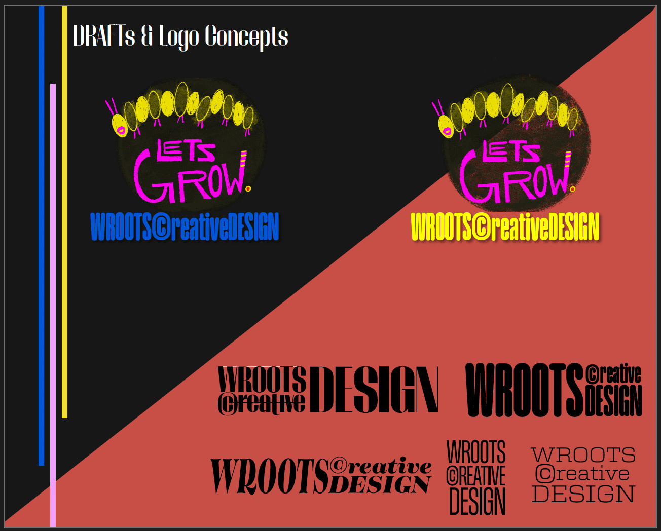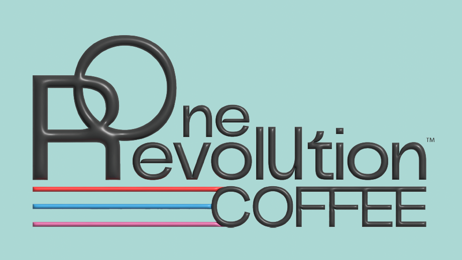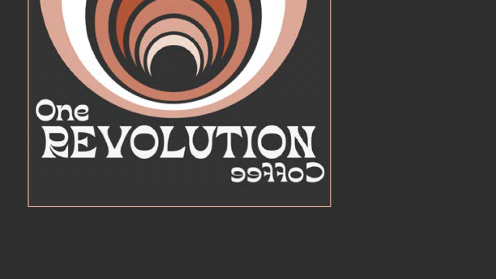


The above collection showcases a complete Brand Design of the initial build of the
Brand Identity Campaign for WrootsCreative Design.
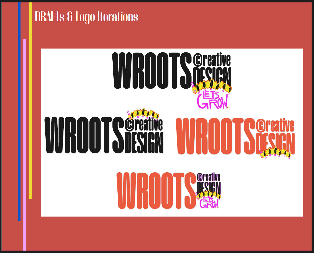
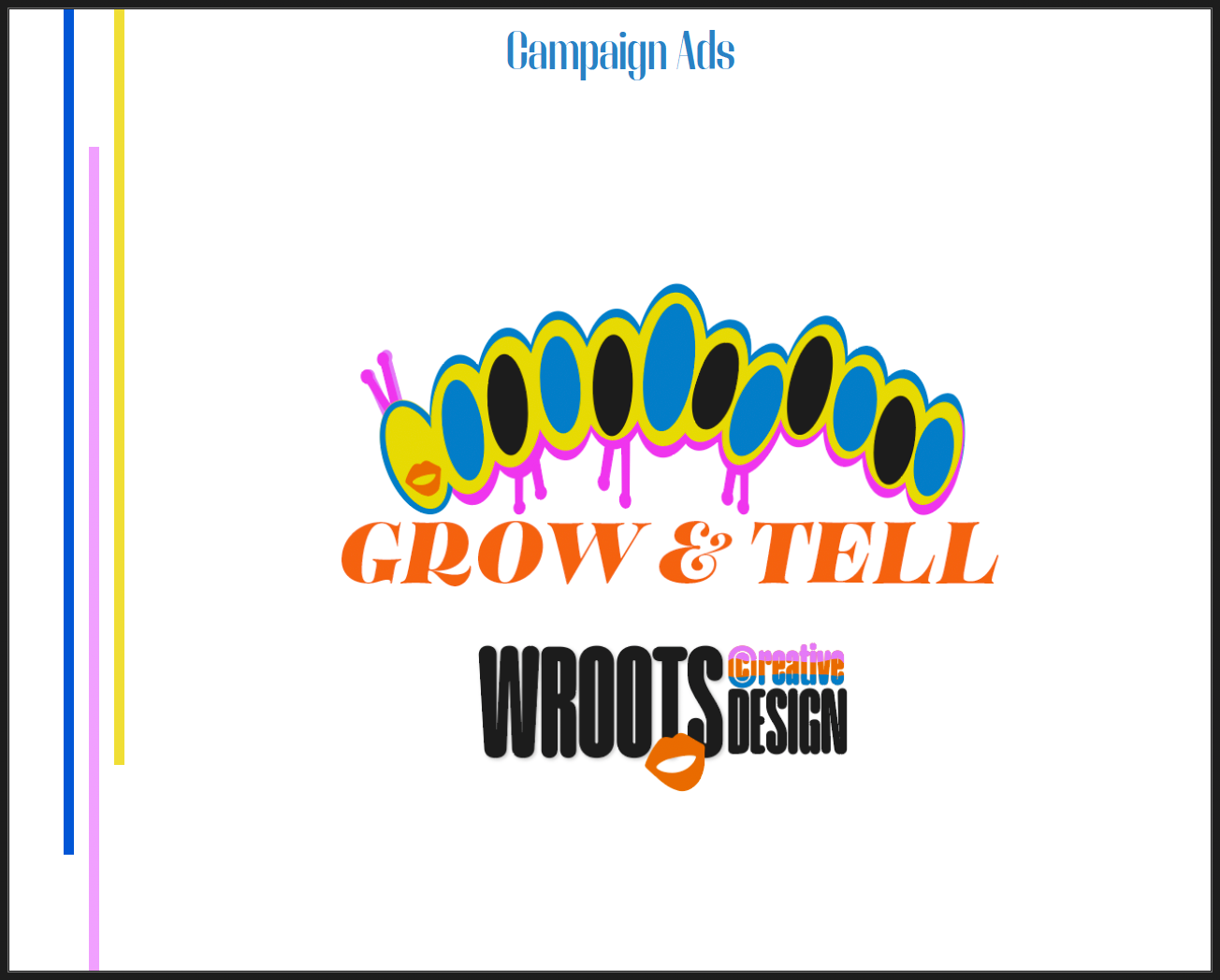
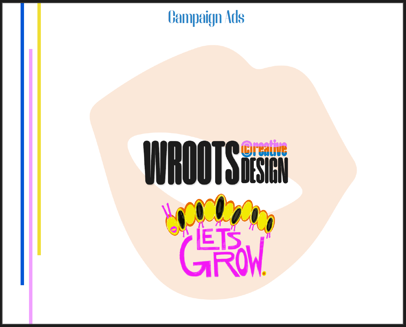
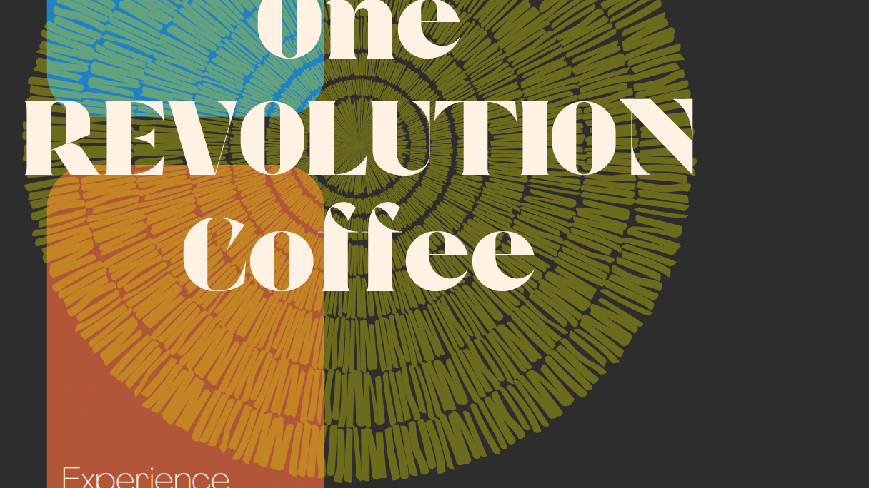
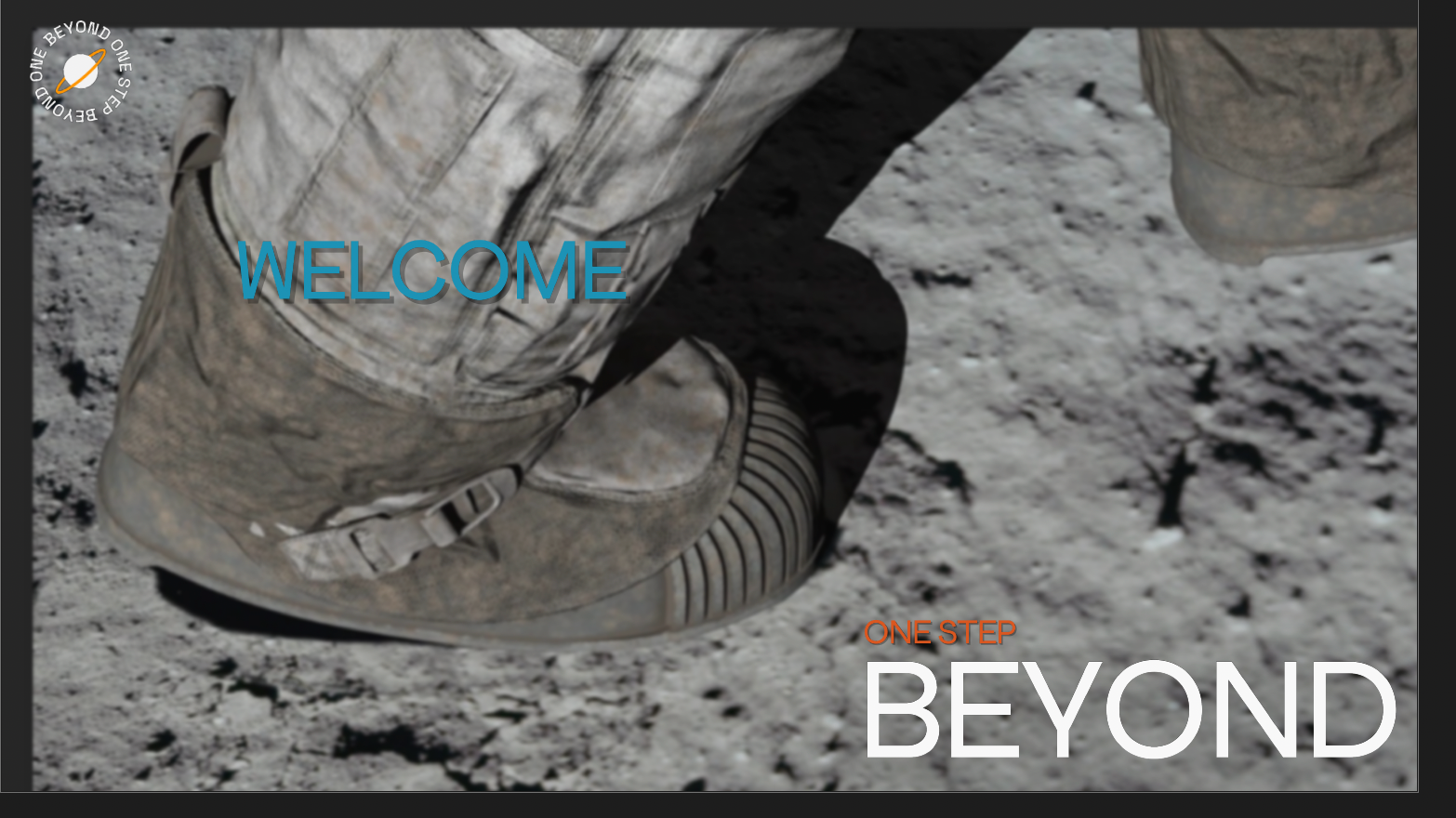
The below collection is a Reworked Rebrand Campaign for Wroots Creative Design
Case Study: Reworking the WrootsCreative Design Brand Identity
Objective
For this assignment, I revisited and reworked a previous project to refine the brand identity of WrootsCreative Design. The initial project (first version) was a foundation for exploring design concepts that aligned with the core values and mission of the brand. However, through feedback and a more critical lens, I identified opportunities to push the boundaries of the design while retaining its essence. This reworked version (second iteration) focuses on elevating the brand identity through cleaner execution, refined typography, and enhanced versatility.
For this assignment, I revisited and reworked a previous project to refine the brand identity of WrootsCreative Design. The initial project (first version) was a foundation for exploring design concepts that aligned with the core values and mission of the brand. However, through feedback and a more critical lens, I identified opportunities to push the boundaries of the design while retaining its essence. This reworked version (second iteration) focuses on elevating the brand identity through cleaner execution, refined typography, and enhanced versatility.
Challenges in the Original Design
In the first iteration, the brand identity introduced a strong visual foundation, but there were areas for improvement in Consistency, the original design experimented with multiple logo variations and concepts, which made the overall identity feel fragmented.
Application Versatility, while creative, some elements of the initial design lacked adaptability for different mediums, such as digital and print.
Typography Integration, the original use of fonts had potential but required more cohesion and precision to unify the brand’s voice.
Approach to the Rebuild
The reworked project aimed to streamline and refine the brand while maintaining the creativity and boldness of the original vision. Key priorities included:
Consolidating Concepts, simplifying and focusing the logo and design elements for clarity and impact. Typography Refinement, adjusting font choices and layouts to improve readability and alignment with professional branding standards.
Scalability and Functionality, ensuring the updated design worked seamlessly across various applications, from social media to outdoor advertising.
Key Enhancements in the Reworked Version
Logo Evolution, The revised logo consolidates elements into a more cohesive structure, reducing visual clutter and focusing on a balanced, recognizable layout.
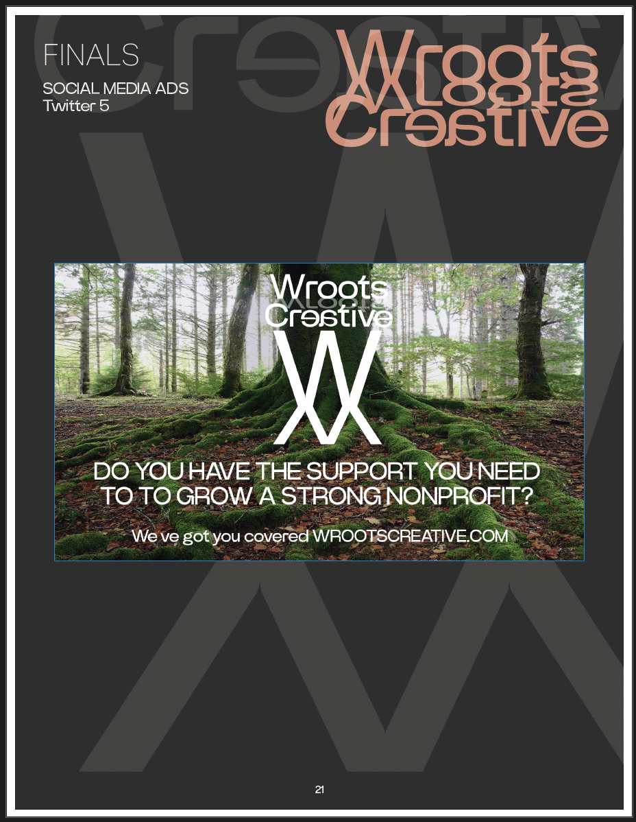
Experimentation with layering and bold type helped achieve a more modern, impactful look. Expanded Applications, The reworked identity includes mockups for outdoor advertising (e.g., bus stops) and social media campaigns, showcasing its adaptability.
Campaign ads like “Who’s That Brand?” integrate the new logo into dynamic layouts, reinforcing brand recognition. Improved Taglines and Messaging, Taglines like “Let’s Talk About It” and “Who’s That Brand?” were reintroduced in a more visually engaging and fun way, adding personality and versatility to the brand voice. Streamlined Visuals,
The second iteration eliminates excess graphic elements and focuses on clean, professional execution while maintaining the creative edge.
Results of the Rebuild
The reworked identity achieves a balance between creativity and functionality, allowing WrootsCreative Design to present itself as both innovative and professional. The updated branding is more versatile, scalable, and cohesive, ensuring it can be effectively implemented across all platforms and mediums.
Reflection
By revisiting and improving a new version of the brand identity, I gained a deeper understanding of balancing creative exploration with practical application and implementing feedback and insight. The final result is a brand identity that not only represents WrootsCreative Design’s mission but also demonstrates growth in my skills as a designer.
Explore the Full Project
Please also check out the project on my Behance Portfolio, https://kristinwoosley.myportfolio.com/
Please also check out the project on my Behance Portfolio, https://kristinwoosley.myportfolio.com/