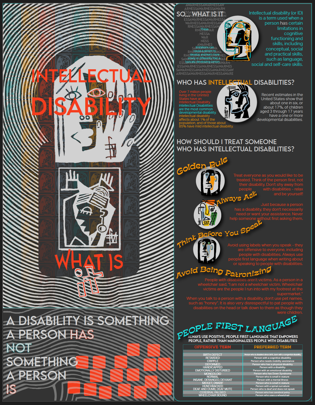
Case Study: Raising Awareness About Intellectual Disabilities
Project Overview
This project was a meaningful opportunity to design a one-page educational piece focused on fostering awareness and understanding of intellectual disabilities. The goal was to create something not only visually striking but also deeply informative, helping audiences connect with the message of inclusion and respect. This piece was designed to inspire empathy, educate about respectful communication, and encourage the use of People-First Language.
Objectives
Educate
Provide a clear understanding of intellectual disabilities and their impact in a way that’s easy to grasp.
Provide a clear understanding of intellectual disabilities and their impact in a way that’s easy to grasp.
Promote Inclusion: Offer practical advice to encourage positive interactions and language use.
Break Stereotypes:Challenge common misconceptions and shift perspectives toward greater empathy.
Design Highlights
1. Bold Central Imagery
I centered the design around a vibrant, abstract figure to humanize the topic and draw attention to the individuality of people with intellectual disabilities. This image serves as a reminder that a disability is just one part of a person’s story.
1. Bold Central Imagery
I centered the design around a vibrant, abstract figure to humanize the topic and draw attention to the individuality of people with intellectual disabilities. This image serves as a reminder that a disability is just one part of a person’s story.
2. Clear Information Hierarchy
Thoughtfully layered text guides the reader, balancing bold headlines like “Intellectual Disability, What Is It?” with concise, digestible sections. This approach ensures clarity without overwhelming the viewer.
3. Engaging Visuals and Symbols
Each concept, like the “Golden Rule” or “People First Language”, is accompanied by simple, relatable visuals to make the advice memorable and easy to follow.
4. Intentional Color Palette
The combination of bright orange and grayscale tones ensures the content is visually engaging while maintaining a sense of professionalism and focus.
Key Focus Areas
Breaking Down the Basics
Starting with the definition of intellectual disabilities, the piece highlights key statistics, such as how 7 million people in the U.S. are affected, grounding the topic in relatable context.
Practical Communication Tips
Sections like “Think Before You Speak” and “Avoid Being Patronizing ”Offer Actionable Advice,” making it easy for readers to adopt more inclusive habits in their daily lives.
Empowering Words Matter
A thoughtfully designed chart showcases the power of language, contrasting outdated, offensive terms with positive alternatives. By advocating for *People First Language*, the guide emphasizes that words can uplift or marginalize, depending on how they’re used.
Challenges and Solutions
This design was all about balance: presenting educational content in a way that felt approachable and personal while being visually impactful. The biggest challenge was distilling so much valuable information into a single page. Careful attention to layout and prioritization helped ensure the message remained powerful without overwhelming the audience.
The Impact
This piece stands out as both a resource and a conversation starter. By combining visuals and practical advice, it encourages audiences to rethink how they engage with people who have intellectual disabilities. I’m especially proud of how it blends creativity with purpose, reminding us all that inclusion begins with small, everyday actions.
Personal Reflection
This project reflects my passion for using design to make a difference. It was rewarding to create something that could open minds and spark change. The process reinforced my belief in the power of visual storytelling to educate, advocate, and connect on a human level.