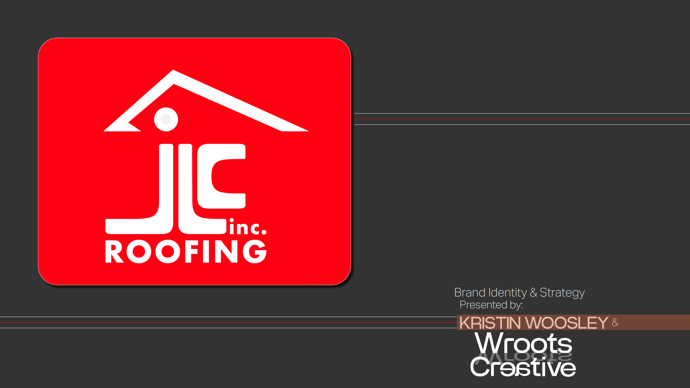
Typography Exploration
The study of typeface: Akzidenz-Grotesk
This project celebrates Akzidenz-Grotesk, the seminal sans-serif typeface that revolutionized Swiss typography and influenced modern graphic design. It explores the historical origins, evolution, and timeless impact of this typeface through a mix of creative layouts, sketches, and finalized designs. The aim is to highlight the functionality and artistry of Akzidenz-Grotesk while showcasing its versatility across diverse design applications.
This project celebrates Akzidenz-Grotesk, the seminal sans-serif typeface that revolutionized Swiss typography and influenced modern graphic design. It explores the historical origins, evolution, and timeless impact of this typeface through a mix of creative layouts, sketches, and finalized designs. The aim is to highlight the functionality and artistry of Akzidenz-Grotesk while showcasing its versatility across diverse design applications.


Case Study
Challenge:
To present a comprehensive narrative of Akzidenz-Grotesk's significance in design history while creatively interpreting its visual and functional essence.
To present a comprehensive narrative of Akzidenz-Grotesk's significance in design history while creatively interpreting its visual and functional essence.
Solution:
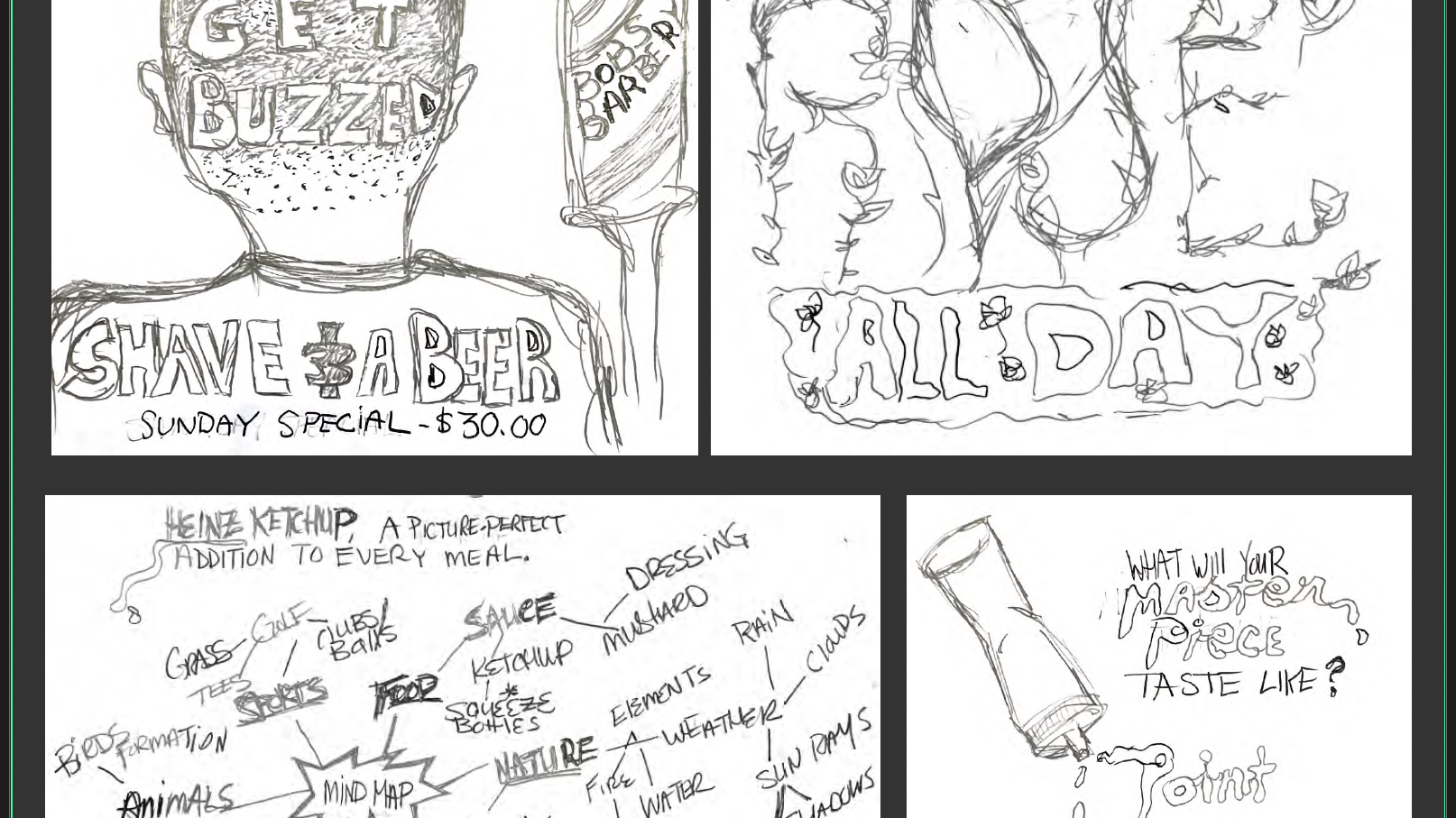
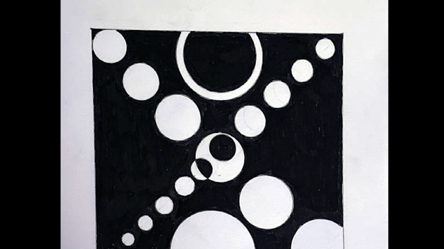
The project was rooted in detailed historical research and visual experimentation. Using a neutral color palette inspired by the typeface’s Swiss origins, the layouts were designed to emphasize clarity, precision, and balance—qualities synonymous with Akzidenz-Grotesk. Thumbnail sketches explored dynamic compositions, negative space, and typographic structures, culminating in finalized layouts that showcased the typeface's impact through bold visual storytelling.
The project was rooted in detailed historical research and visual experimentation. Using a neutral color palette inspired by the typeface’s Swiss origins, the layouts were designed to emphasize clarity, precision, and balance—qualities synonymous with Akzidenz-Grotesk. Thumbnail sketches explored dynamic compositions, negative space, and typographic structures, culminating in finalized layouts that showcased the typeface's impact through bold visual storytelling.
Outcome:
The final presentation not only educates but also inspires, making the case for Akzidenz-Grotesk as a cornerstone of contemporary design. By weaving historical context with modern application, the project underscores the enduring relevance of classic typography in shaping design innovation.
The final presentation not only educates but also inspires, making the case for Akzidenz-Grotesk as a cornerstone of contemporary design. By weaving historical context with modern application, the project underscores the enduring relevance of classic typography in shaping design innovation.
Lets take a look at that process!